Shadow Lines After Sundown: Specifying Sandblasted Letter Edges That Still Read
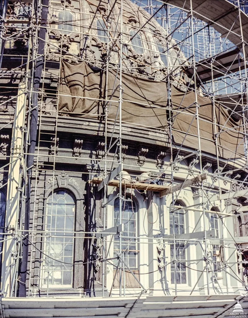
Photo: USCapitol, Public domain, via Wikimedia Commons
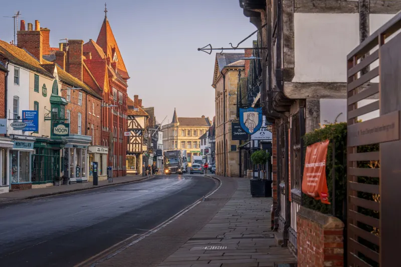
On a bright June afternoon, almost any sign reads. By mid-November, the test is different. The sun sits low, shop windows glow, and the high street becomes a mix of glare and shadow. Sandblasted lettering has an advantage here — it is three-dimensional — but only if the edge is specified properly. A shallow etch or a rounded shoulder can turn crisp lettering into a grey smudge after dark. The edge is what catches the light, and the shadow line is what carries the word.
The shadow line is the sliver of darkness cast by the side wall of a recessed letter, or beneath the lip of a raised one. It gives the eye a boundary. Without it, contrast relies only on colour and the sign goes flat. That matters more in a UK winter than most sign specifiers admit. By the time the clocks go back, many shopfronts are being read mostly under streetlight, window spill and the odd pair of headlights. If the letter edge is soft, the sign has nothing to say.
Depth, bevel and undercut: the three variables
Depth is how far the blast cuts into the material. Bevel is the angle at the top edge of the letter. Undercut is the slight recess beneath the face of a raised letter, or the angled side wall of a recessed one. All three affect the shadow line, but they do different jobs.
On stone, depth does most of the work. A 6mm to 10mm cut in sandstone or limestone will throw a visible shadow in low light, provided the side walls are clean. Too shallow and the letter disappears at dusk. Too deep and you can create a ledge that holds water, which is never a good idea in a British freeze. A slight chamfer on the top edge helps the letter catch raking light without turning the sign into a birdbath.
On glass, depth is measured in frosted milky-ness rather than millimetres. The etch itself is shallow, so the shadow line comes from the edge of the mask and the consistency of the blast. A crisp, even frost with a defined boundary reads well under front lighting. A fuzzy edge — often caused by mask lift or an inconsistent nozzle angle — looks like a smudge from across the road. For glass, specify a sharp mask edge and a consistent frost depth rather than chasing physical depth that is not there.
On metal, the edge is often a chamfer or a rolled profile on raised lettering, or a clean wall on a blast-etched plaque. Metal reflects streetlight, so a polished bevel can catch a glint while a matte edge reads as shadow. That can be useful, but it needs to be deliberate. A random mix of bright and dull edges looks like wear, not craft.
The angles that flatten a sign
A sandblasted edge does not happen by accident. It is the result of how the nozzle is held, how the resist is cut and how the grit behaves. The common mistakes are consistent across workshops.
Blasting straight down onto the surface is the big one. If the nozzle is perpendicular, the side walls of a recessed letter end up vertical and the undercut is minimal. The letter can still be deep, but the shadow line is weak because there is no angled plane to catch light. A slight, consistent angle — usually 10 to 20 degrees off perpendicular, depending on material and mask — creates a sharper wall and a more defined shadow.
Inconsistent angle around a single letter is another quiet killer. One side of the 'O' gets a crisp undercut, the other gets a soft shoulder. At noon you might not notice. At 4pm, under a low sun, the letter looks lopsided. Good blasting is boringly repeatable.
Overblasting is the third. It rounds the edge, opens the mask and creates a soft halo around the letter. The sign may look nicely frosted, but the shadow line has gone. The same happens with too fine a grit at low pressure: the profile gets smoothed rather than cut. You end up with what one sign-maker I know calls a sandblasted marshmallow — soft, pale and completely forgettable after dark.
Finally, mask lift. If grit gets under the resist, the edge blooms. That is not a lighting problem; it is a preparation problem. It will flatten the sign in every light.
The raking-light test
You do not need a laboratory to check whether a letter profile will work after dark. You need a torch, a dark evening and a bit of honesty.
Ask your sign-maker for a sample panel or a full-size proof at the intended viewing height. At dusk, or in a darkened workshop, place a low-angle light — a clamp lamp or a strong torch — about 15 to 20 degrees to the face of the sign, from the side. Stand back ten metres, then twenty. Look at the shadow line. Is it clean and continuous? Does the counter of the letter — the inside space — stay open? Can you read the word without guessing?
Then repeat with the kind of light the sign will actually meet: warm LED streetlight, cool white shopfront spill, maybe a car headlight angle. Check from both directions. A sign that reads from the left but not the right is half a sign.
For glass, do the test twice: once with front light and once with backlight. Etched glass behaves differently depending on where the light sits. For stone, wet the surface slightly — not soaking, just damp — because a November drizzle changes how the shadow reads. For metal, look for glare. A bright bevel can be a friend or a nuisance, depending on the street.
Photograph the result. A raking-light photo is the most useful approval document you can have. It shows the edge doing its job, or not.
What to put in the specification
You do not need to write a technical manual. A few clear lines will do. Ask for a consistent undercut on stone lettering, a defined chamfer on metal, and a sharp mask edge on glass. Ask what nozzle angle will be used. Ask for a raking-light photo before full production. If the sign is going into a conservation area or a listed frontage, mention that early — deep relief and historic fabric need a careful conversation.
At Sandblast Sign Co., the conversation usually starts with the viewing distance and the light. The font matters, of course. But the edge is what people actually read when the sun drops. Get the profile right and the sign keeps working long after the shop window has become the brightest thing on the street.