The View From the Other Side of the Road: Distance-First Design for Sandblasted Signs
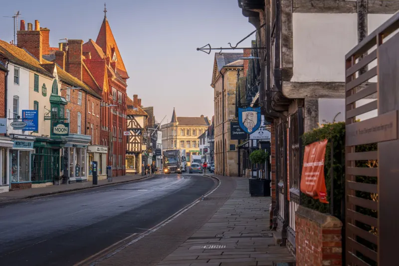
There is a particular kind of disappointment that comes from seeing a sign in situ for the first time. In the workshop, under good light, with your nose a metre from the timber, the sandblasted lettering looks sharp. The shadow line is crisp. The grain is doing something lovely. Then you stand on the opposite pavement, squint through a bus shelter, and realise the main name has turned into a grey smudge.
Sandblasting is a craft of depth, and depth reads beautifully up close. But most signs are not judged up close. They are judged from the far kerb, from a car park entrance, from the end of a driveway, or from a moving vehicle at a junction. That is why a distance-first approach matters more than another round of font tweaking.
Start where your visitors start
Before you decide anything about lettering, go and stand where people actually approach. Not the ideal spot. The real one. The opposite pavement outside the shop, the bus stop ten metres along, the mouth of the car park, the point where a driveway meets the lane. Take note of what is between you and the sign: bins, A-boards, parked vans, hanging baskets, a hedge that looked small in March and is now a small forest.
A useful shorthand is the fifty-pace rule: walk roughly fifty paces back and see what survives. For a high street unit that might take you across the road and down a bit. For a rural business it might only get you to the gate. The distance is not the point. The point is to design for the approach, not the workbench.
Letter height is a relationship, not a number
There is no magic cap height that works everywhere. A rough starting point for comfortable reading is around 25mm of letter height for every 3 metres of viewing distance, but treat that as a sketch, not a building regulation. A main name read from 10–15 metres on a UK high street will usually want to be bolder and larger than a secondary line read from the pavement edge. A driveway sign viewed from 25 metres needs a different hierarchy again.
What matters is the relationship between the most important word and everything else. If the business name, the service line and the website are all fighting at the same size, the far view becomes a paragraph. At distance, people do not read paragraphs. They catch a shape, a name, a colour. Give them one thing to catch.
Contrast does the heavy lifting
Sandblasted depth creates a shadow line, and that shadow can do a lot of work in raking light. But British weather is not a lighting technician. On a flat grey afternoon, a low-contrast sign—grey on grey, oak on oak, frosted glass with a pale interior behind it—can lose its lettering entirely.
A quick test is to photograph the proposed sign from the far kerb, convert the image to black and white, and look at it on your phone. If the letters disappear, the contrast is too polite. This is especially important on glass, where what sits behind the panel matters as much as the etch itself. A dark interior behind frosted lettering gives you one result; a bright window display gives you another. For timber, a painted background and a sandblasted, painted letter face will usually hold up better at distance than a natural-oak-on-natural-oak scheme that looked subtle in the samples.
Give the letters air
Sandblasting is not a high-resolution printing process. It has a physical edge, and fine details can fill, blur or disappear once you step back. Tight spacing and condensed letterforms are the usual culprits. At close range they look efficient. From across the road they merge into a stripe.
Choose letterforms with open counters and generous spacing. Leave more negative space around the main name than feels strictly necessary in the workshop. That breathing room is not decoration; it is what lets the eye separate one word from the next when the sign is seen at an angle, in the rain, by someone who is already thinking about parking.
Mounting height and the angle of approach
A fascia sign is often viewed from below, from across the road, or obliquely as someone walks along the pavement. That angle matters. Lettering that reads well straight-on can foreshorten badly when seen from the side. If the main name only works from directly opposite, it is not working hard enough.
Mounting height is a compromise between visibility and context. Too low and it disappears behind street furniture. Too high and it leaves the pedestrian's natural sightline. For most shopfronts, the main name wants to sit comfortably within the upper fascia zone, clear of bins and hanging signs, and with enough contrast to survive the shadow of a neighbouring building. For driveway and entrance signs, check the view from a car, not just on foot. A sign at 1.2 metres can be perfect from the lane and completely hidden by a hedge from the passenger seat.
Build a hierarchy, not a noticeboard
The far view should tell you the name. The middle view can tell you what the business does. The close view can carry the craft details—the border, the grain, the small line of contact information. Trying to make every line readable from fifty paces is how signs become crowded.
A simple structure works for most UK businesses: one dominant name, one short descriptor, and one quiet supporting line. If the website is long, shorten it or leave it for the door. If the phone number is essential, give it its own sign or panel rather than cramming it under the name. Sandblasted signs are not cheap to redo, so it pays to be ruthless about what the main sign is for.
Tests worth doing before the blast
You do not need a design degree to check a sign at distance. You need a bit of cardboard, a phone and a friend who is not emotionally attached to the project.
- Make a full-size paper or cardboard mock-up and tape it in place. View it from the far kerb, the car park entrance and the end of the drive.
- Take a photo from each approach point at eye level. Shrink it to thumbnail size on your phone. If the name is still clear, you are in good shape.
- Do the squint test. Squinting mimics the way the eye resolves a sign at distance. If the lettering turns to mush, simplify.
- Check it on a dull day, not just a bright one. British signage lives in grey light for much of the year.
- Ask someone who does not know the business to read it from the far point. Do not prompt them. Just watch where their eyes go.
Close-up craft still counts
Designing for distance does not mean ignoring the close view. Sandblasted signs are tactile; people touch them, photograph them and notice the depth of the cut. A well-judged border, a clean edge and a considered paint finish all reward the visitor who comes near. But the close view should be the second pleasure, not the rescue plan. If the sign only works when you are standing underneath it, it is not doing its main job.
As we move through 2026, high streets and business parks are busier with visual noise than ever. The signs that hold their own are rarely the most complicated ones. They are the ones that were tested from the far kerb before anyone opened the nozzle.