Kerbside Killers: Five Shopfront Sign Mistakes UK Independents Keep Making
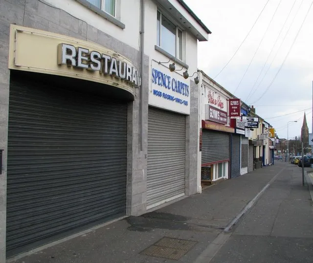
Photo: Ross, CC BY-SA 2.0, via Wikimedia Commons
Kerb appeal is not a vanity metric. It is the difference between a passer-by slowing down and a passer-by checking their phone. On a UK high street, your sign is competing with parked vans, bin bags, estate agents' boards and whatever the weather is doing. Most shopfronts have about three seconds to make an impression. These are the five mistakes that waste those seconds, and how a sandblasted approach can sort each one without making the place look like a theme park.
1. Picking a font on a laptop instead of from the pavement
That elegant script looks lovely on a 27-inch screen. From the other side of the road, in the rain, with a bus going past, it turns into a grey smudge. Thin strokes disappear. Tight letter spacing closes up. Lowercase letters with small x-heights become guesswork. The fix is not to choose a boring font. It is to choose a legible one and give it room. A sandblasted glass sign can use simple, confident letterforms with a deep frost that catches light and shadow. The letters do not need to be huge, but they do need to be clear at street distance.
2. Using materials that surrender to British weather
Mild steel rusts. Cheap vinyl peels at the edges. Acrylic can craze and yellow. Painted MDF swells when water finds a way in. None of this is a mystery, yet shopfronts still get specified on price alone. A sign is an exterior product. It should be chosen for the outside. Sandblasting works on glass, stone, slate and metal, and it does not rely on a printed layer sitting on the surface. A sandblasted granite nameplate or an etched glass panel will shrug off rain, frost and the general damp optimism of a British winter. It still needs sensible fixing and maintenance, but it will not fail because the laminate lifted.
3. Designing contrast for a sunny day in July
British skies are grey for a lot of the year. That is not pessimism, it is lighting design. A dark logo on dark glass, a pale frost on pale render or a brushed metal letter on a grey wall can look sophisticated in a photo and invisible on a Tuesday in February. Contrast is not just about colour. It is about tone, texture and light. A sandblasted panel can use a deeper etch, a back-painted frost or a contrasting backing to create separation. If the sign is going on glass, think about what is behind it. If it is going on a wall, think about how it will read when the sun is not doing you any favours.
4. Ignoring the planning rules around projecting signs
A projecting sign can be a lovely thing. It is also the bit of shopfront signage most likely to attract a letter from the local authority. Advertisement consent, conservation areas, listed building consent, size, projection and illumination all come into play. The rules vary by area and by building. Guessing is not a strategy. A beautifully made sandblasted hanging sign is still a sign, and it still needs the right permissions. Check before you drill. A sign that cannot be installed is not a bargain, however good the quote.
5. Saying too much
A shopfront is not a leaflet. It is a landmark. The moment you add every service, every opening hour, every social handle, every offer and every accreditation, the main message gets buried. Passers-by do not read; they scan. Give them one thing to remember. A sandblasted name or mark in the glass, with the detail handled elsewhere, is often enough. Let the window do the quiet work. If someone needs to know more, they will come in.
The fix is not more signage
None of these mistakes are solved by adding another layer. They are solved by editing. Choose a typeface that works at distance. Choose a material that suits the climate. Choose contrast that survives a grey sky. Check the planning rules before you fall in love with a hanging sign. And say one thing well. Sandblasting is not a magic wand, but it is a useful discipline. It forces you to commit to a design, cut it into the material and live with it. On a UK high street, that kind of permanence is worth more than another sticker on the glass.