Before the Nozzle Opens: A Practical Pre-Flight for Sandblasted Signs

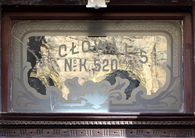
Photo: Internet Archive Book Images, No restrictions, via Wikimedia Commons
Sandblasting has a useful kind of finality. Once the resist is cut and the grit starts moving, you are no longer editing a design; you are removing material. That is the appeal for shopfronts, reception walls and plaques that need to look at home in a British high street. It is also why the quiet week before production matters more than the noisy hour in the booth.
The best sandblasted signs are not saved by a heroic last-minute rescue. They are saved by a boring, disciplined approval stage. Here are the checks that should happen before any nozzle opens.
Why the approval stage matters more than the blast
A printed sign can be reprinted. A vinyl graphic can be peeled and replaced. A sandblasted sign can be re-made, but the old one usually ends up in a skip. That changes the economics of getting it right first time. For a shopfront, the cost is not just the panel; it is the access equipment, the fitters, the lost trading hours and the chance that the replacement glass or stone never quite matches the original batch.
So treat approval as part of production, not an administrative hurdle. The aim is simple: freeze the artwork, prove the process and confirm the site before anyone books the blasting slot.
Artwork that survives the resist
Start with vector artwork, not a screenshot of a logo pulled from a website. Curves should be clean, paths should be closed and there should be no stray anchor points hiding under letterforms. If the design includes fine detail, check that it can actually be reproduced at the size requested. A flourish that reads beautifully on a business card may vanish entirely on a frosted glass partition.
The artwork also needs to be set up for the process. That means understanding how the mask will be cut, whether the design is positive or negative, and which areas are being frosted, etched or left clear. A common pre-production meeting is spent discussing the design when the real issue is that nobody has agreed which parts of the glass are meant to be opaque.
Ask for a 1:1 paper proof where possible. It feels old-fashioned, but a full-size print on the workshop floor catches more problems than a PDF on a laptop. You can stand back, walk past it and see whether the sign reads from the pavement rather than only from the edge of a desk.
Letterforms, kerning and the thin-stroke trap
Sandblasting flatters bold shapes and punishes nervous ones. Very thin strokes can become fragile in the mask, lose definition in the blast or disappear altogether once the sign is viewed from a few metres away. This is not a reason to redesign every typeface, but it is a reason to test the actual letterforms at the actual size.
Kerning deserves a proper look too. When a word is blasted into stone or glass, awkward gaps become more noticeable because the eye has fewer distractions. Check the spaces between letters, especially around capitals, diagonals and punctuation. A logo that relies on tight spacing may need a little optical adjustment for a hard material. That is not a compromise; it is craft.
If the sign includes small legal text, opening hours or a unit number, be honest about viewing distance. A brass plaque by a door can carry more detail than a fascia viewed from across a car park. If the detail cannot be read comfortably, simplify it.
Mask tolerances and minimum features
Every sandblasting process has a practical limit. The mask needs enough material around a shape to hold together, and the blast needs enough room to create a clean edge. Tiny islands, hairline gaps and very close parallel lines can all cause trouble.
This is where a good sign maker earns their keep. They will know whether a particular resist can hold a fine serif, whether a deep carve needs a stouter letterform, or whether a frosted glass design should be simplified before it reaches the cutter. Ask for the minimum feature size to be confirmed in writing. It is much easier to adjust a line weight on screen than to explain why a delicate monogram has turned into a smudge.
Mask tolerances also affect the finish. A design that looks crisp in a flat proof may need a small amount of extra spacing to avoid bridging when the resist is applied to a textured stone. That is not a failure of the design; it is the material asking for a different conversation.
Material samples: the only proof that counts
A screen proof shows shape. A material sample shows truth. Before production, ask to see the actual substrate with the actual finish. Glass can look grey, green or almost invisible depending on the batch and the lighting. Stone varies from block to block. Metal may be brushed, mirror-polished, powder-coated or left to patinate.
A small blasted sample board is worth more than a hundred renderings. It lets you compare depth, contrast and edge quality. For glass, hold it against a window and against a dark wall. For stone, look at it in daylight and under the warm lamps that will actually light the sign. For metal, check how the blasted area catches light at an angle; a finish that looks subtle on a workbench can look patchy on a wall.
If the project involves multiple panels, ask how the material will be selected. Natural stone and coated metal can vary between batches. A sensible pre-production check confirms whether the whole sign family will be made from one batch or whether slight variation is part of the deal.
Site survey: dimensions are not the whole story
The tape measure is only the beginning. A proper site survey records the substrate, the condition of the wall or frame, the fixing centres, the access arrangements and the things nobody photographs until they matter. Hidden cables, alarm sensors, uneven masonry, deep reveals and narrow pavements can all change the specification.
For a shopfront, check the sightlines from both directions. A sign that reads perfectly head-on may be approached at an angle all day. For an interior glass partition, check what is behind the glass. Frosting that looks elegant against a plain wall can become a busy pattern when a meeting room full of people is visible through it.
Also confirm who is responsible for making good after installation. Drilling into stone, fixing through a metal panel or mounting a glass sign with stand-offs all leave a mark. Agree the fixing details and the making-good before the sign is made, not after the fitter is on site with a drill.
Fixings, lighting and the things nobody photographs
A beautiful sign can be let down by a bracket. Fixing details should be drawn, not assumed. Will the sign be face-fixed, flush-mounted, suspended or set into a reveal? Are the fixings part of the design or meant to disappear? Will stainless steel stand-offs look right against a heritage brick wall, or would a concealed French cleat be better?
Lighting is the other quiet influence. Sandblasted glass and textured stone respond beautifully to raking light, but they can also flatten out under a dull overcast sky or a badly placed downlight. If the sign will be lit, review the lighting design alongside the sign design. A sample viewed under a desk lamp is not a rehearsal for a November pavement.
A sign-off that actually protects the budget
Before production, gather the approved artwork, the material sample, the 1:1 proof, the site survey notes and the fixing drawings in one place. Confirm the final wording, spelling, dimensions and finish in writing. Then freeze the artwork. If something changes after that point, everyone should understand what it means for cost and timing.
This is not bureaucracy for its own sake. It is how you protect the craft. Sandblasting rewards preparation because it is so wonderfully unforgiving. Get the checks right, and the blast becomes the satisfying part: the moment when a drawing finally becomes a real, permanent thing on a British street.