Fingers First: Building Tactile Signage Into UK Public Buildings
Photo: sandblasted tactile Braille sign glass public building UK, via diller-powerparts.de
Tactile signage is often treated as a compliance box to tick near the end of a refurbishment. A plaque gets stuck to a wall, a Braille strip gets added beside a door, and everyone hopes the access officer signs it off. In busy UK public buildings — schools, hospitals, libraries, civic centres — that approach tends to age badly. The sign that looked neat on handover starts to lift at one corner, collects grime around its edges, or gets picked at by people waiting in a queue. The fix is not a tougher adhesive. It is a different way of making the sign in the first place.
What the Equality Act expects in practice
The Equality Act 2010 does not prescribe a single tactile sign product. It asks public bodies and service providers to make reasonable adjustments so disabled people can access information and services. In practice, that means a blind or partially sighted visitor should be able to find a reception desk, a lift, a toilet or a room number without having to ask a stranger. The public sector equality duty pushes the same point upstream: accessibility should be designed in, not bolted on.
For signage, that usually means raised lettering, Braille where it is appropriate, good visual contrast and a sensible mounting height. It also means consistency. A tactile sign that works at the main entrance but disappears halfway down a corridor is not much of a system. Procurement teams increasingly ask for mock-ups and a sample board before sign-off, which is sensible. A finger does not care how good the render looked.
Why integral texture beats applied plaques
An applied plaque sits on top of a surface. That means it has edges. Edges catch cleaning cloths, trolley wheels, fingernails and the general grit of a building that gets used. In a school corridor or a hospital outpatient department, an applied sign can become a wobbly rectangle with a grubby halo.
Sandblasting works differently. The lettering, symbols and Braille dots are cut into the material itself. There is no separate layer to peel, no raised rim to harbour dirt, and no adhesive to fail after a few summers of cleaning. The texture is part of the glass, slate or metal. That makes it easier to wipe down, harder to vandalise and much more likely to still be legible in ten years.
It also feels better. A sandblasted edge has a slight tooth to it. Braille dots can be blasted to a consistent depth and spacing. For a visitor running a hand along a wall, that consistent texture is the difference between a sign that feels designed and one that feels like a sticker.
Glass, slate, metal: matching the material to the building
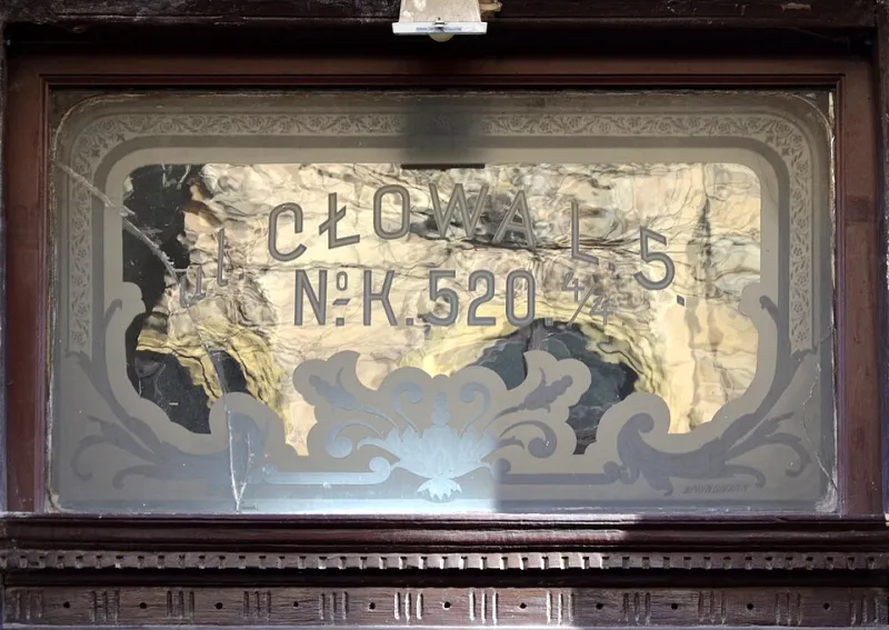
Etched glass is the natural choice for doors, screens and interior partitions. It lets light through, keeps sightlines clear and can carry a tactile message without turning a glazed entrance into a noticeboard. In hospitals and libraries, where borrowed light matters, this is often the best fit.
Slate suits exterior entrances, gateposts and civic plinths. It is dense, frost-resistant and takes a crisp blast. A slate nameplate or room marker can sit happily on a stone wall without looking like it arrived from a completely different building.
Metal — particularly stainless steel or anodised aluminium — works well where hygiene and heavy cleaning are priorities. It can be sandblasted to produce a subtle, durable texture. The finish is less warm than slate or glass, but in a service corridor or a plant room it makes practical sense.
The mistake is choosing one material for the whole building because it is easy to specify. A hospital might need glass at the main reception, slate at the external entrance and metal in back-of-house areas. That is not inconsistency. It is matching the sign to the place.
Designing for fingers as well as eyes
Tactile signage has two audiences. One reads with their eyes; one reads with their fingertips. Good design serves both.
Lettering needs to be large enough to see and raised enough to feel. Braille needs to be positioned where a hand naturally falls, not squeezed into the bottom corner because the layout was tight. Contrast matters, but so does glare. A highly polished metal sign under downlights can be harder to read than a matte one with softer contrast.
Mounting height is another common slip. Signs placed at eye level for a standing adult can be awkward for a wheelchair user or a child. A consistent height, usually around 1.4 metres to the centre of the sign, is a useful starting point, but it should be checked against the actual building and its users. A school will have different needs from a civic office.
Mock-ups are worth the time. A full-size paper template taped to the wall tells you more than a screen ever will. At Sandblast Sign Co., we would rather adjust a layout before the mask is cut than after the glass is etched.
The craft is in the consistency
Sandblasting is a simple process with a lot of variables. The depth of the blast, the resistance of the mask, the grit size and the finish all affect the final texture. A shallow etch can look pretty but feel almost flat. A deep blast can be too aggressive for glass. The skill is in controlling those variables across a whole run of signs, so the Braille dot at the main entrance feels the same as the one outside the library.
That consistency is what public buildings need. Not a one-off hero sign, but a system that works quietly, day after day, for people who may never see it clearly at all. Integral texture is not a luxury finish. In a high-traffic public building, it is the practical choice.