A Family Resemblance: Keeping One Brand Legible Across Sandblasted Stone, Glass and Metal
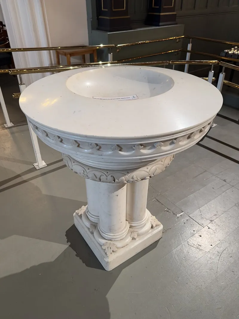
Photo: Wolfmann, CC BY-SA 4.0, via Wikimedia Commons
A brand guideline is usually written for ink and pixels. Then someone asks for the logo in reception, the same mark on the glass meeting-room wall and a matching plaque by the front door. Suddenly the identity has to survive stone, glass and metal, each with its own grain, reflectivity and appetite for detail. The result can be a happy family or three distant cousins who happen to share a surname.
Keeping a brand coherent across sandblasted substrates is not about forcing every sign to look identical. It is about deciding which parts of the identity must stay constant and which parts can flex. That conversation belongs at the design stage, not on the workshop floor.
A brand is not a flat file
On screen, a logo is a set of shapes with a colour value. In a sandblasted sign, it is a change of surface. Glass may become frosted rather than inked. Stone may be carved away or left raised. Metal may be etched through a coating or blasted to a softer, matte tone. The mark is no longer sitting on top of the material; it is part of the material.
That shift changes how the identity reads. Contrast becomes a matter of light and texture rather than colour. Edges soften or sharpen depending on the process. A solid shape can feel lighter when it is frosted glass, or heavier when it is a dark stone inset. The brand has to be translated, not just enlarged.
For a workplace, this matters because the signs are often seen in sequence. A visitor sees the exterior plaque, then the reception wall, then the glass partition beside the meeting rooms. If each piece has been designed in isolation, the brand can feel scattered even when every individual sign looks handsome.
Stone sets the tone
Stone is the anchor of many sign families. It feels permanent, grounded and quietly expensive, which is why it suits reception desks, entrance plinths and exterior name plaques. But stone is not a neutral canvas. Limestone, slate and granite all have different grain, porosity and colour variation. Blasting can expose that character or fight against it.
A fine logo with delicate counters may need simplifying for a coarser stone. A thin typeface that looks elegant in print can become fragile when carved or blasted. On the other hand, a bold mark that feels too heavy on paper can settle beautifully into a stone surface because the material gives it weight and context.
When reviewing a stone sample, look at it from the distance people will actually stand. A reception plaque is often viewed from a metre or two, while an exterior sign may be seen from the pavement or a passing car. The same level of detail will not work for both. Stone rewards a slightly broader approach: clear shapes, confident spacing and a finish that lets the natural surface speak.
Glass changes the edge
Glass is the opposite temperament. It is precise, reflective and often asked to do two jobs at once: carry the brand and preserve a sense of openness. A frosted logo on a meeting-room partition can look crisp and modern, but it also behaves differently depending on what is behind it. Against a white wall it may read as a soft grey shape. Against a dark corridor it may almost disappear.
Reflectivity is the other issue. A glass sign can pick up windows, lights and movement, which means the brand is not always seen in ideal conditions. The design needs enough contrast and enough scale to survive glare. Fine detail can be lost in a reflection even when the etching itself is perfect.
This is why glass benefits from a test piece viewed in situ, or at least against representative backgrounds. A frosted sample on a desk tells you very little. Hold it up to a window. Place it against a dark jacket. Look at it from an angle. The brand should still be recognisable when the glass is doing what glass does.
Metal holds the line
Metal sits somewhere between stone and glass. It can be brushed, polished, coated or left to age. It can carry very fine detail, but the finish determines how that detail reads. A blasted stainless-steel plaque may look subtle and architectural in one light and almost blank in another. A powder-coated metal sign can offer strong contrast, but the blasted area needs to be judged against the coating rather than against raw metal.
Metal is often the connective tissue in a sign family: door plaques, directory panels, lift signs and wayfinding. That makes consistency of finish especially important. If one panel is brushed and another is mirror-polished, the same logo can look like two different brands. Specify the finish, the direction of the grain and the fixing method as part of the identity, not as a last-minute procurement detail.
Depth, lighting and viewing distance
Sandblasting introduces depth, even when the etch is shallow. That depth catches light and creates a subtle shadow line. In a brightly lit reception, the effect may be crisp and graphic. In a dim corridor, it may become soft and low-contrast. Neither is wrong, but the design should anticipate both.
Viewing distance is the quiet test of any sign family. A logo that works on a laptop may need to be redrawn for a fascia, simplified for a glass partition and spaced more generously on a stone plaque. This is not inconsistency. It is the same brand speaking at different volumes.
A useful exercise is to lay out the whole family at scale: exterior plaque, reception sign, glass manifestation and wayfinding. Stand back and look for the family resemblance. Do the letterforms feel related? Is the spacing consistent in spirit? Does the mark hold its shape across all three materials? If one piece feels like it belongs to a different company, adjust it before production.
Test proofs and finish samples
A screen proof is useful for layout, but it cannot tell you how a brand will behave in a material. Ask for physical samples that show the actual substrate, the actual blast depth and the actual finish. Where possible, include part of the logo rather than a generic rectangle. A sample with a curve, a counter and a fine stroke will reveal more than a plain patch of frosting.
For a multi-sign project, a small sample board is a sensible investment. It gives the client, designer and maker a shared reference. It also reduces the chance of surprises when the first full panel comes out of the booth. The board does not need to be precious; it needs to be honest.
Specify a family, not a one-off
The most coherent workplace signs are specified as a system. That means agreeing the substrates, finishes, fixing details, lighting assumptions and artwork adaptations together. It also means accepting that the logo may need slight optical adjustments for each material. A stone plaque and a glass partition should not be forced into the same line weight if one material cannot carry it gracefully.
The aim is recognition. Someone should be able to walk from the pavement into the reception and feel the same brand around them, even though the materials change underfoot. Sandblasted stone, glass and metal each have a strong personality. A good sign family lets them keep it while still making the brand feel like one thing.